
Project Specs:
Mobile Website
Project 1
Due: 02/25 Critiques: 02/26
Task
Make a 3 versions of a Mobile Website using knowledge of viewports, screen densities, responsive grids and preliminary knowledge of media queries as well as basic css animation and some bootstrap. Our mission here is stick to simple design, elegant code, and basic responsive menus. Think about the minimal requirements for a mobile website.
3 Versions
In this assignment, you are required to design three versions of the same website using Photoshop/Illustrator/InDesign (your choice). 1. Client’s Preference, 2. Compromise, 3. Wildcard/experimental. From these three versions you are required to code one. If you do code all three, you automatically get an A for this assignment as long as you fulfill all minimum requirements.
Content
For this assignment you are selecting an established creative professional and designing a website for them. The choice is up to you and it should reflect a professional with whom you are most likely already familiar and aspire towards. Keep your own career in mind and take advantage of this assignment by producing quality work worthy of a professional portfolio; THIS IS VERY IMPORTANT.
Here are some suggestions on creative professionals, let me know if I forgot something…
Architects Product Designers Artists
Interior Designers Graphic Designers Fashion Designers
Web Designers Concept Designers Photographers
General Designers
Minimum Requirements
- 4 pages (bio, gallery, contact, newsfeed/ home)
- Interactive menu (:hover, display, and other minor CSS animations)
- 1 Responsive grid system of your choice
- Media Queries are present
- Cohesive theme
- Demonstrate Understanding of design principles
- Demonstrate preliminary knowledge of Typography
My Project
Artist View

For my site that relates to how the artist would like it I went off of his works of art. Herb Lubalin’s work is mostly in black and white because he was colorblind. I also went off of the website of his study center in NYC, because he doesn’t currently have his own site. The website of his study center is very minimalistic and not colorful at all. So with my site I made it super simple to navigate and I only used tints of black.
My View
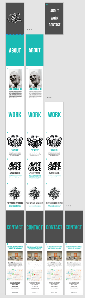
For my site that represents how I would like to see a website turn out I decided to go with another simplistic look and navigation. This website is a one pager with only three colors in the color scheme. I decided to go with gray, white, and teal. I went with the teal color because one of his works uses the color and I thought it looked really nice with the gray and white. Overall, I figured that my view turned out the best so that is the one I coded.
Wild/ Experimental View
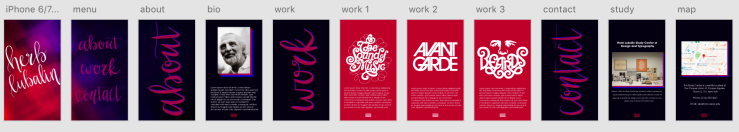
For my wild idea I decided to play off of the fact that Herb was actually colorblind. In one article that I read it says that since he couldn’t see colors his work was normally wither red and green or red and blue. When I saw he used red and blue I instantly thought of 3-D movies and images. So the site uses red and blue on a black background so it pops out more than it would on like a white. The only issue I see with this view is that it kind of hurts the eyes when looked at for too long, but once again this is an experimental piece so it should be a tad crazy and different.
